Branding Magento Templates
The word “template” still has a negative connotation, especially when branding and design is discussed. No client I know favors a “templated look.” Templates conjure images of generic banners and page layouts that lack the branded personality and energy of the client’s business.
But the reality of the web world is that almost everything is initially based on a template. After all, there are only so many ways that a page can be laid out. Couple that with years of user data on e-commerce best practices and it makes perfect sense to identify a template to serve as the base of your online shop. This article walks through a proven process in identifying and customizing a typical e-commerce template, but keep in mind there are a million ways to skin a website.
The example client for this exercise will be a standard B2C e-commerce business focusing on sporting apparel. This business grosses about $15M annually through online sales. They are migrating their old M1 website to M2 and want to overhaul the design completely. The template provider for our example is Magento partner WeltPixel, which offers a variety of themes and extensions in use by 34,000+ merchants.
The rebranding process is divided into four main phases:
- Discovery
- User experience (UX)
- User interface (UI)
- Handoff to development
Phase 1: Discovery
During discovery, there are efforts to document the project scope by both the technical and interface design teams. Although the majority of focus is on the technical requirements, the interface design team has some critical questions that need to be answered.
Is there a brand style guide, and is it up to date? Are there any unique aspects to the client’s products that need to be incorporated in the customer journey? For example, is there an interactive product recommendation tool, or an application that customizes the customer’s product?
The answers to these questions will enable the design team to research and understand the branding requirements and identify pages and sections of the website that need custom treatments.
Phase 2: User Experience (UX)
User experience involves understanding the customer personas and their purchase paths through the website. The results of this effort are a website structure and navigational taxonomy. Not every page needs to be represented, but the key templates should be identified in a spreadsheet.
Below is an example of a simplified e-commerce spreadsheet, listing the required templated pages/sections. In the second column are recommended template links to use as a foundation for the page, based on the previous discovery phase. The third column is for notes on additional requirements.
Example:
| Page Name | Recommended Template | Notes |
|---|---|---|
| Global Nav | https://pearl.weltpixel.com/v2 | Use for footer |
| Home | https://pearl.weltpixel.com/v12 | |
| Category | https://pearl.weltpixel.com/v1/apparel.html | |
| Product Detail | https://pearl.weltpixel.com/v7/beaumont-summit-kit.html | |
| Cart | https://pearl.weltpixel.com/v12 | Default |
| Checkout | https://pearl.weltpixel.com/v12 | Default |
| Order Confirmation | https://pearl.weltpixel.com/v12 | Default |
| Promotion Landing Page | https://pearl.weltpixel.com/banner-slider-lazy-loading | Customize configurations |
| Blog | https://marketplace.magento.com/magefan-module-blog.html | Purchase and configure extension |
| Events | https://marketplace.magento.com/webkul-event-manager.html | Purchase and configure extension |
| Contact | https://pearl.weltpixel.com/v1/contact/ | |
| CMS Pages (About, etc.) | https://pearl.weltpixel.com/weltpixel-about-us-v1 | Allow for multiple content types |
| Admin | https://pearl.weltpixel.com/v2 | Default |
Having this information will jump-start the wireframing process because you can use the templates as the basis for the wireframes. In fact, in many cases, you can save time and effort by forgoing the wireframes for the more straightforward sections such as Checkout, Customer Dashboard or Blog, if everyone agrees that they can adhere to the default out-of-the-box template layout.
Phase 3: User Interface (UI)
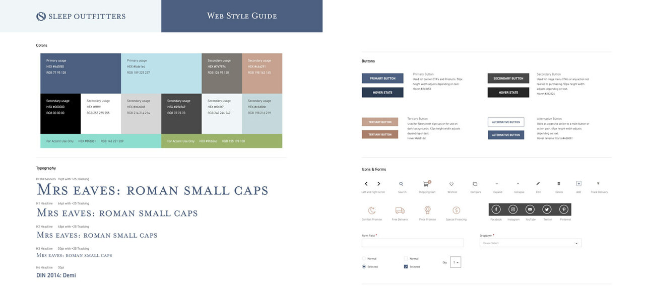
The user interface is where the visual aspects of branding really start to be applied. The brand style guide is a critical component of this phase. If the client doesn’t have an updated web style guide, this is a good opportunity to develop one. A web style guide should outline the following brand elements.
- Logo
- Brand colors and usage
- Font styles and usage
- Photography styles
- Icon styles
- Button styles
- Any other graphic elements
Below is an example of a partial web style guide.
Armed with this and the information from the discovery and user experience phases, the design team has all the elements they need to produce an on-brand design solution.
Branding Areas on the Homepage
In this example, we are using a desktop version, but most of the comments also apply to mobile.
Header: The header contains the logo and top navigation. Make sure the logo is saved as a .svg and that it is balanced within the space, otherwise it will look like it’s been slapped on.
Navigation menus: Mega menus provide real estate to present your product categories and even promote them with small branded banners.
Main banner: Establish the brand and brand message in this key area through a brand-appropriate, compelling image. Use a video if it is properly designed. Pay attention to the call to action.
Promotional banners: Another area to reinforce the brand, whether you use a solid color, a graphic, a photo, text or a hybrid approach.
Product images: Product photography is a key factor in a purchase decision. Businesses can infuse branding into product shots through the use of background colors, iconography, the use of models, angles and lighting styles.
User-generated content (UGC): Incorporating your Instagram feed into your website can create a strong brand statement, especially if it’s well curated.
Footer: Pick a color from your style guide. You can use this area for additional brand messaging.
Other areas to consider:
- Fonts – Check the style guide and establish the correct font classes.
- Buttons – This is another opportunity to infuse the brand into the wording on the buttons, button color, style and rollover effects.
- Iconography – Why go with standard out-of-the-box icons when you can create your own branded ones?
- Animations – The way that page sections appear as the user scrolls and the style of animation used to reveal menus and content can be customized.
- Messaging – Your brand voice should come through on all your content. Headlines are the most visible so use them to reinforce your brand voice.
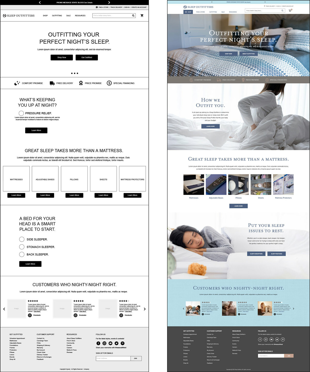
Below is an example of a wireframe (UX) to user interface (UI) for a website homepage.
As with the homepage above, the rest of the website pages can be branded in a similar way. Some pages are easier to brand than others; for example, the company’s “About Us” page is all about branding, while the checkout process has less opportunity for branding.
Phase 4: Handoff to Development
The communication between the UI and the FED (front-end developer) teams is the next key to a successful outcome. Ideally the UI design files have been prepared in Photoshop, Sketch or a similar graphics application. These applications allow the FED team to inspect the CSS styles, measurements, colors, download optimized assets and more. This process increases efficiency and minimizes integration errors.
Where this approach fails is in cases that a developer team applies the branding to the templates without aesthetic direction. For example, a person can have all the ingredients to a recipe, but if they don’t know what order to add the ingredients or how to properly mix them, the result is inedible. This is why an experienced UI designer should be available to review the output of the development team.
Conclusion
The template branding effort can result in a custom-looking e-commerce experience if care is taken to identify opportunities for brand infusion. An experienced art director can make the difference between a website that looks slapped together vs a compelling branded experience.