How to Beat Holiday Season Competition by Reducing Checkout Friction
The fight is real. With many more businesses selling online since the beginning of the COVID-19 pandemic, chances are that the fight for online shoppers will be fiercer than ever this holiday season.
Competition happens at every stage of the online funnel.
No matter how big or small, e-commerce merchants have been focusing on increasing conversion at each of these seven key steps of the online sales funnel:
- Getting traffic to your website (advertising, growth hacking)
- Showing the right products to the right person at the right time (search, personalization)
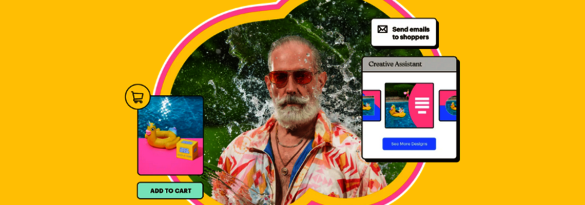
- Getting shoppers to add items to the cart (product pictures, descriptions, collections)
- Reminding shoppers they have items in their cart and need to checkout (emails, retargeting)
- Getting shoppers to complete checkout (checkout UX optimization, live chat, customer service)
- Shipping the right product fast and communicating about it (logistics, parcel tracking, customer service)
- Converting shoppers into loyal customers and getting them to leave reviews
The beauty of the Adobe Commerce, formerly Magento, ecosystem is that it offers a wide range of tools to help with all these functionalities. If you increase conversions — both at the top and bottom of your funnel — you get a multiplier effect. (Here is an article on my company’s blog that shows an example of how a merchant increased conversion by three times through a combination of search and checkout optimization.)
No one remembers the runners up
It costs time and money to choose and invest in the right solutions and strategies to get traffic to your site and inspire shoppers to buy your products.
The final really takes place at checkout and the stakes are high. The average cart abandonment rate is 70% globally, according to the Baymard Institute, which means that when you’ve successfully managed to get 10 shoppers to place items into their carts, only 3 end up completing their orders.
What would it mean for your business if you convert four orders instead of three? Just one more order boils down to 30% more transactions: a direct impact to your bottom line.
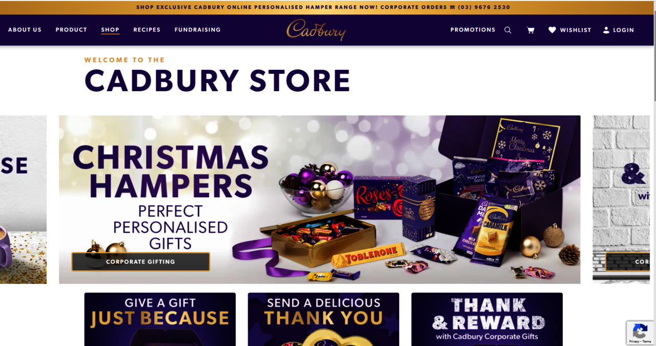
Pictured: Example of a Magento 2 store that is always holiday ready. Visit the site.
Why do shoppers abandon their carts and what can you fix today?
Those that win the race are websites that offer a better checkout experience, i.e., an experience that removes pain points from this critical process.
According to the Baymard Institute, which has been surveying U.S. online shoppers with an increasing sample size for the last five years, there are two types of cart abandonment drivers. The first type comprises issues related to the business model and cost structure, in particular shipping cost, free returns and delivery time.
The second type can be addressed simply by changing the design of your checkout page. And that’s the good news.
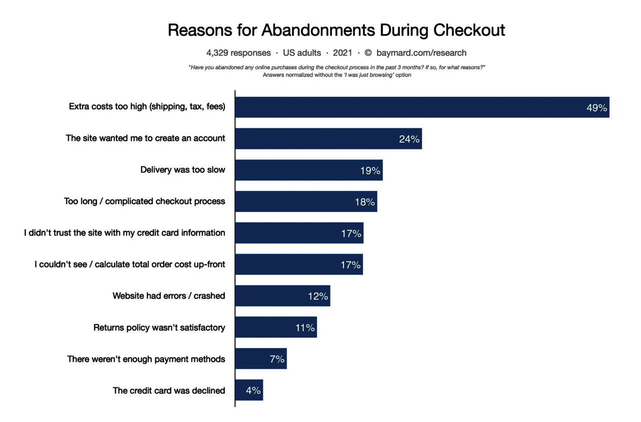
Pictured: Screenshot of chart from Baymard.com.
Here are quick wins you can address for this peak season:
1 in 4 shoppers leave checkout when they are forced to create an account.
“The site wanted me to create an account” is the second-most important driver for cart abandonment, with 24% of respondents stating it as a reason why they leave during the checkout process.
According to a recent Amazon Pay report, an uplift of 10–30% in conversion rate can be seen when high-volume e-commerce stores test going from forced account creation to optional.
As a merchant, we know how valuable it is to capture new customer accounts; however, shoppers don’t like it. Here are some reasons why:
- They expect the checkout to be slower when they are forced to create an account
- They don’t want to create yet another account on another website
- They don’t want to receive spam and promotional offers
As a result, you need to give your customers options and make it easy and natural to create an account while completing their shipping details. Here’s a demo of this.
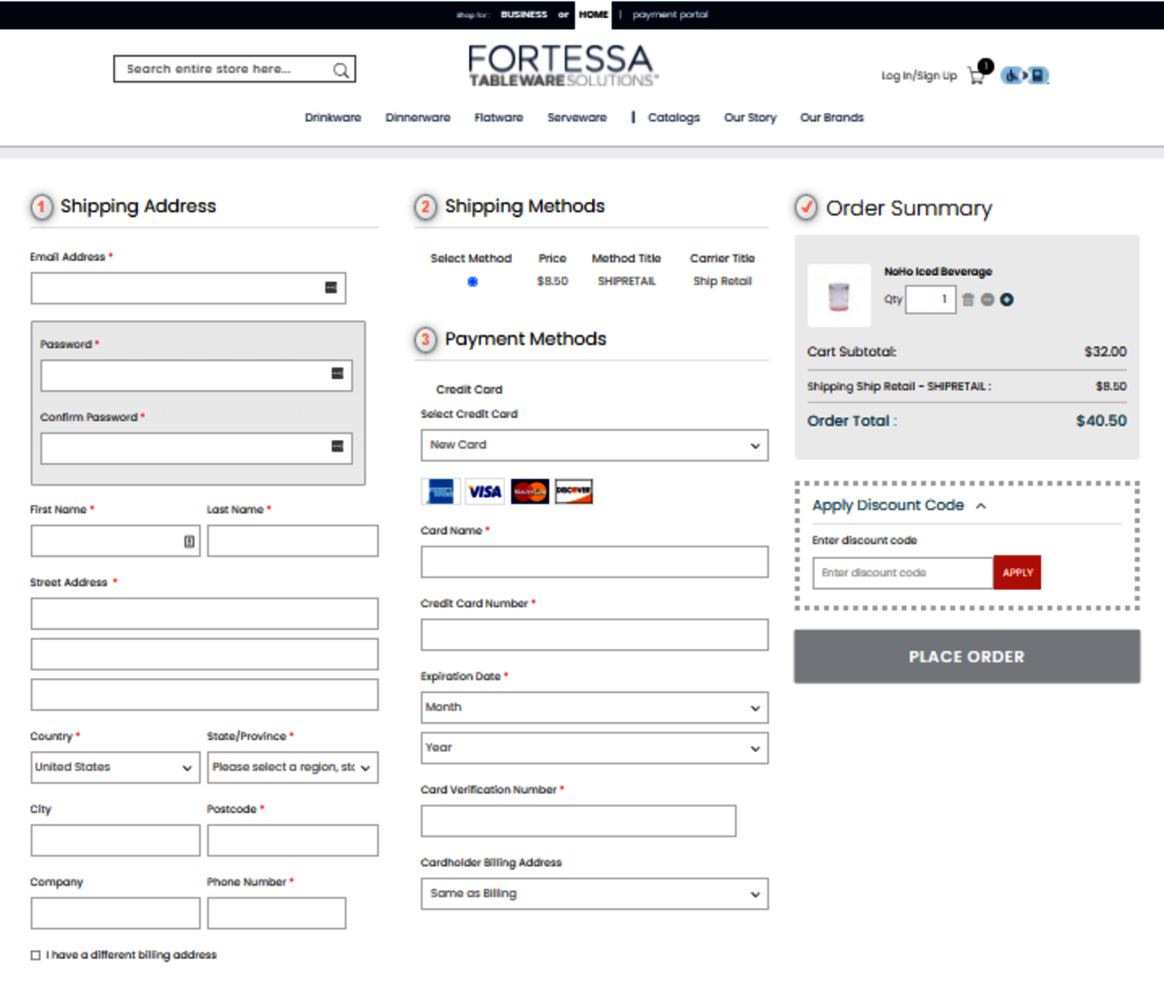
Or, you can make it a compulsory field like Fortessa, which sells dinnerware in the U.S. (pictured below).
1 in 5 shoppers leave checkout when the process is too complicated
Usability studies confirm that the more fields are required from shoppers, the least performing the checkout page.
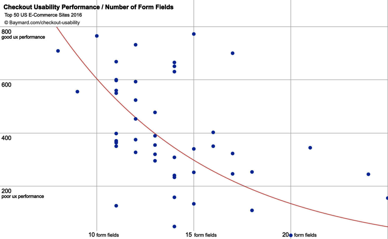
Pictured: Screenshot of chart from Baymard.com.
It is natural to want to know your customers the best you can, but there is arbitrage to be made between knowing one customer really well and losing nine others versus capturing, let’s say, four customers right now.
That’s why a best practice is to ask the bare minimum just to be able to correctly ship the order. Once shoppers buy from you and engage with your brand, you can always get to know them at a later stage.
17% of online shoppers don’t trust websites with their credit card information
Whether your brand is well known or not, shoppers will always be wary about leaving their financial details.
One way to address that is to offer various payment method options such as PayPal, Amazon Pay or Google Pay, among others, since those store consumer payment details safely and securely, without sharing them.
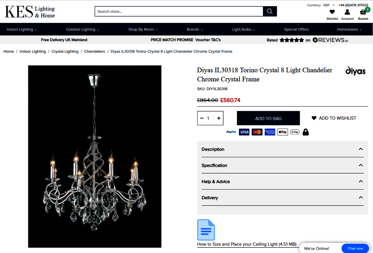
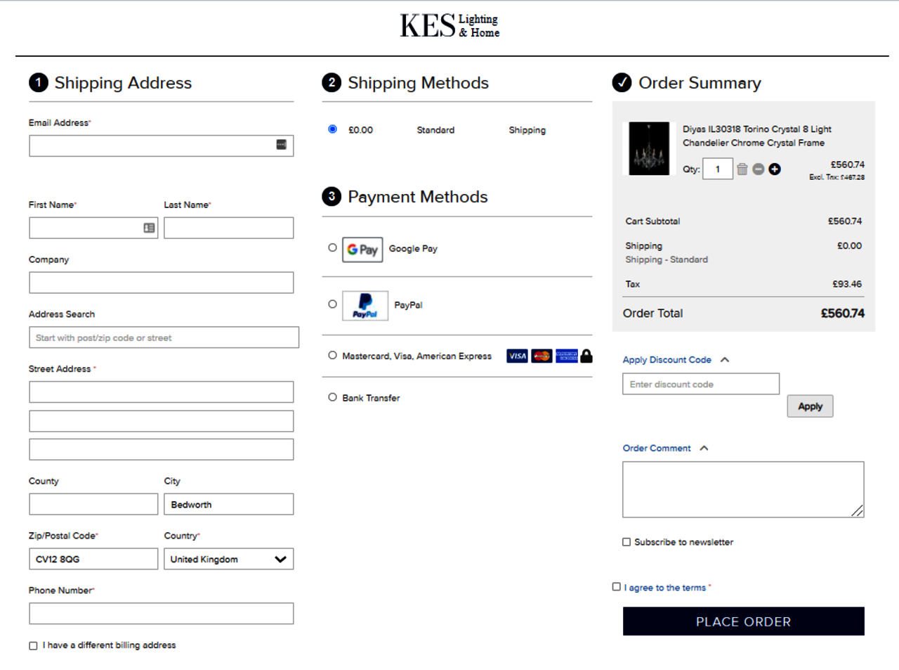
Some best practices implemented by KES Lighting, a U.K. retailer, include:
- Offer Apple Pay, Google Pay and PayPal on their product page
- Added a padlock icon next to payment options on both their product and checkout page
- Offer live chat on their product page
- Display social proof and 5-star rating under the top navigation bar
- Use Hyvä Themes to boost website performance and make the browsing experience faster
As a result, the website experienced a 37% improvement on page loading time, a 47% increase in online sales conversion and a 12% increase in transactions. Read the case study here.
17% of online shoppers abandon their cart when they don’t see order totals upfront
This is probably the hardest thing to change in the Magento 2 default checkout, but it’s key to avoid any surprises and get those orders through.
Depending on your target audience demographics, they might prefer one-, two- or three-column layouts, so the order total might be on the right-hand side or all the way at the bottom.
Here are examples of Magento 2 stores offering different checkout page layouts:
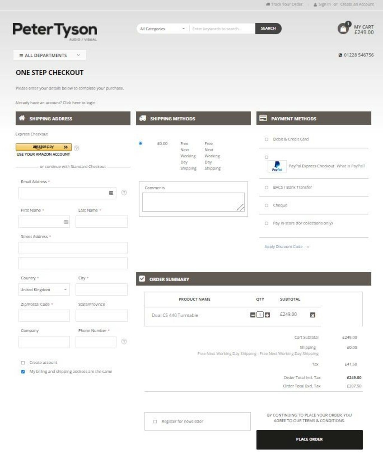
1. Peter Tyson Audio Visual
Three-column with order total at the bottom; users can save time by logging in with their Amazon account.
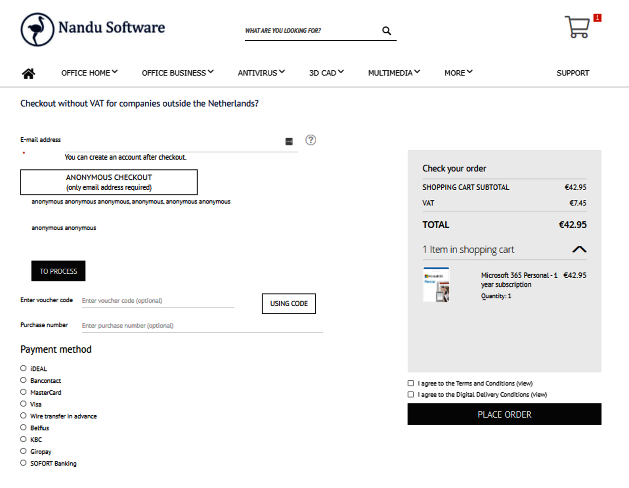
2. Nandu Software
Two-column with no shipping address required.
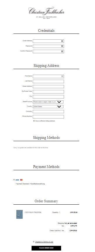
3. Christian Fischbacher
One-column option from this luxury bed linens and home textiles retailer.
Optimize and repeat
Once you’ve improved conversion across various stages of your Magento 2 store, there are always opportunities to do better. It’s not a “set and forget” process. Your competitors will keep innovating and capturing market share.
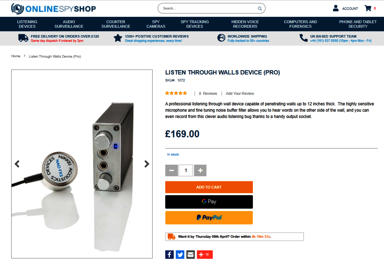
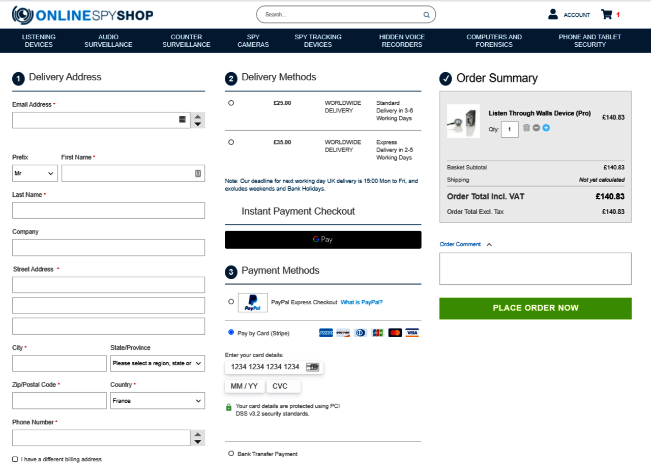
As an example, Online Spy Shop, a U.K. leader in surveillance equipment, launched their Magento 2 website in 2017. Four years later, they made improvements to their homepage, product page and checkout page to increase conversion across the board.
Here is their new product page, which includes the addition of delivery information as well as more payment options.
And, here is their new checkout page, which includes more trust signs, better styling and improved UX.
For more even best practices from developers and merchants, check out Commerce Co-op case studies.